
Note from Jane: The following post is the first in a series that will offer tips and advice from successful authors about self-publishing, specifically those who use Barnes & Noble’s Nook Press as part of their overall sales, marketing, and distribution strategy. This series is sponsored by Nook Press, which means they have paid for these posts to run on my site. However, because I do not pay my guest bloggers, I am using the sponsorship money to pay these authors for providing guest posts. I think it’s a win-win for everyone—for the authors (they get paid), for Nook Press (they get attention), and for me (because I like to pay writers for their content whenever I can). First up in the series: Colleen Gleason (@colleengleason). Keep reading for her insights.
One of the best things about working independently with NOOK is that I can change the packaging and positioning of my books at the drop of a hat. I can test things out with readers to see what sorts of covers and book descriptions work better than others.
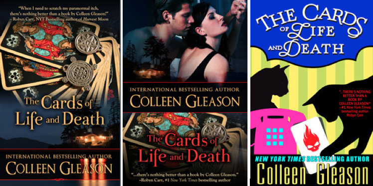
Recently, I did a repackaging—for the third time!—of some of my romantic mysteries/gothic romances: The Shop of Shades and Secrets and The Cards of Life and Death.
This isn’t the first time I’ve changed my covers, but this is the first time I’ve made such a radical change. (When I repackaged my medieval romances, I stayed with the same sort of look—just different models and colors.) I spent a lot of time trying to figure out why these books weren’t doing as well as I thought they should, given the reviews and responses from readers and editors alike.
Originally, the covers looked more like a traditional gothic mystery cover—like a Barbara Michaels, Antoinette Stockenberg, or Mary Stewart book, with mysterious looking houses and dark colors. There is a ghostly/supernatural element to both books, so I thought that would be a good way to showcase that element. Those covers were beautiful, but didn’t seem to capture the attention of the market I was trying to reach: the romance market. So I had the covers tweaked to showcase the couples/romantic element.
However, the sales still weren’t where I thought they should be, given the positive reviews and excellent feedback from readers. So I started asking people—readers and other authors—what they thought about the covers. I was surprised when several people told me they thought the covers were too dark and scary looking—that the books were funny and witty, and the covers made them look too dark, especially with a title like The Cards of Life and Death.

I knew that humorous mystery and romantic mysteries were doing quite well in the market, so I started looking at the covers of those successful series. I realized that with titles that sounded so dark and ominous, I needed to have a cover that indicated the lighter elements of the stories. I found a cover artist who actually read the books before she began to work on the covers. (She also has done covers for other humorous/romantic mysteries.) She was able to bring in several important elements to a fresh, new design: the lighter colors, a more humorous feel, and something that had been missing before—the animals. In both books, there are cats (plus a dog in one) that are critical to the story.
As one might expect, it took me a while to find this designer who could come up with a fresh enough concept for the repackaging. When I initially hired a designer to do the third versions of the covers (another designer did the initial two versions), she wasn’t able to come up with a concept that fit the story, and so we parted ways. It took me another couple of months to find another, who did this final, bright, fresh version.
There are many options for cover designers, and I’ve worked with five different ones

over the last few years. I use a variety because after looking at their portfolios and work samples, I can see what type or genre each artist does particularly well. Since I write in a wide variety of genres (from historical to post-apocalyptic to erotica), when I have a project that needs a cover, there’s usually one particular artist who fits best. I also change cover artists when I’m looking to repackage a book, to give it a set of fresh eyes.
When selecting a cover artist, not only do I look at the actual cover images that have been created, but I also pay attention to the artist’s use of typography. I discuss this at length in a chapter of The Naked Truth About Self-Publishing (The Indie Voice LLC, 2013), but let me say here that to me, excellent typography is probably even more important than the cover image. Good typography—meaning the correct use of fonts as well as layout—is the mark of a professional cover designer, and one that sets amateur covers apart from excellent ones.
My cover design costs range from $100 to $600, though it’s not unusual or unreasonable to pay more. The cost depends on what you’re looking for, how well known the artist is, and whether you want just the front cover or the spine and back. Some artists charge extra for the stock photos they use as well. And if you’re like me and really get into the font choices for a cover, you might have to pay extra for a specific font.
All this work was completely worth it to me, however, because I love the new covers for my gothic romances and my readers seem to also. Sales have increased several hundred percent over the last month since I unveiled the new look (complete with some advertising and social media support).
Colleen Gleason is a New York Times and USA Today bestselling author with more than twenty books in print.


Am I reading the Publisher’s costs wrong on their FAQ, where they stipulate a 40%-66% royalty? If this is so, is that an industry standard charge?
If you’re speaking of NOOK Press as the publisher, first of all, they aren’t a publisher. They’re a distribution system. You (or whoever uploads your work) is the publisher, and you retain the rights to the work. NOOK pays about a 65% royalty to the publisher–to you, the person retaining the rights and formatting/uploading the books.
I would be interested in hearing how to search for a cover designer…
Hi Terry – See response to Colleen Kelly Mellor for more.
But Colleen Gleason, how did you identify artists, in the first place? I first joined LinkedIn (trying to see there whose work I might like), then was inundated by children’s illustrators as forum group and found myself not reading anything after a while because too much was coming across my in-box. Is there any marketplace that shows artists’ samples, so I can glance over, in seconds, to see what I’m looking for? This, I find, is the biggest bug-a-boo to my time constraints.How to get what I want in the shortest time.
Colleen will probably jump in here, but KindleBoards (kboards.com) is often recommended in the indie community as place to look for cover designers; I believe they have a thread dedicated to this.
You might also try Sortfolio (http://sortfolio.com) and Bibliocrunch (http://bibliocrunch.com).
I so appreciate this help…You’re all like a divining rod, in the self-pubbing world. Thank you so much!
Hi Colleen Kelly 🙂
There are lots of ways to find good cover artists.
First, you could simply do a search for ebook cover design.
Second, you could find covers you like from independently published authors on NOOK or elsewhere and find out who did their covers–via email, on their website, or even in the books themselves.
We list several cover design artists (as well as a number of other resources) in our book The Naked Truth About Self-Publishing (the link is posted above).
Some well-known cover artists I know and/or know others who have worked with include:
Kim Killion
Lyndsey Llewellen
PickyMe
OK Creations
Razzle Dazzle Designs
DamonZa
There are many, many more.
Please note that many of these artists schedule their work out weeks in advance.
Who could have imagined choosing just the right cover design could make such a big difference? I’m lucky my small pubber had a good cover designer who knew what the “hook” of y book was even when I didn’t. And I didn’t have to pay for anything. 🙂
[…] The Importance of Your Book Cover: Achieving the Right Fit. […]
[…] Colleen Gleason (Jane Friedman) with The Importance of Your Book Cover: Achieving the Right Fit […]
Thanks for posting!
I found it interested that in each case, I did not like versions ! or 2 at all (they both felt to cluttered and busy). Neither 1 or 2 in either case inspired me to have any interest in the book, so as a reader I would have passed both by.
But then in each case version 3, had me thinking: wow that looks like something I’d read! (I’ve got hundreds of books with similar covers to version 3 and I love cat mysteries.)
With each book, version 1 had me thinking “historical mystery”, which is a genre I don’t like. (I was REALLY shocked by the thinking the first versions said “gothic”?!?! What? If they’d said “gothic” I’d have bought them on sight and not even bothered to read the blurb. I’ve a huge gothic collection. I love gothics. I actually see nothing even remotely gothic about either version 1).
With each version 2, I thought “romance/suspense” and again, had no interest in the genre, so no reason to look into the blurb to find out more, so again, as a reader browsing, I would not have been inspired to buy.
If I’d seen 1 or 2 when browsing for books, these 4 covers would not have inspired me to stop and investigate the book further, so I can see the point of view how intended readers were coming from and why sales were so dismal with versions 1 and versions 2. The covers simply did not match the genre.
With each book, however, as soon as I saw version 3, I instantly thought: “Hey, funny cat murder mystery, I’ll buy that!” I was surprised to hear the importance of the cats to the story, because judging from the covers of 1 & 2, I would never have guessed there were cats in the books, nor would I have guessed the stories were funny. In fact, I would never have even guessed that either was a murder mystery at all! Version 1 said “historical” and version 2 said “romance” when I saw them. Neither came across to me as mureder mystery, but felt more thriller/suspense. I was quite surprised to read they were funny murder mysteries featuring cats!
Anyways, I thought it was really interesting to see the different ways I personally viewed these books, based on which cover was used, and that the cover had such a big impact on how I viewed the genre of the books, and I was surprised that 3 such dramatically different covers had been used for each story versus how genre perception of the covers effected the sales of each edition.
I guess the lesson I see here is that we should research the covers of best sellers in our genre and try to match cover style to our genre.
[…] The Importance of Your Book Cover: Finding the Right Fit by Colleen Gleason […]
[…] The Importance of Your Book Cover: Finding the Right Fit by Colleen Gleason […]
[…] Learn more about her story here. […]