

Today’s guest post is by literary agent Maria Ribas (@maria_ribas); check out her website, cooks & books.
When I was starting out as an editor, I was surprised to see just how very subjective the acquisitions process was. I think I was a little bit (well, a lot) disappointed that there wasn’t a secret equation behind it all.
Even more, it surprised me that the value of a book wasn’t communicated just by the words in the manuscript. Often, it was communicated in subtle messaging about the author: who they were, where they came from, how marketable they were—whatever that meant. That messaging became less subtle and haphazard when it happened through an author website, instead of through a query letter.
I saw how a carefully designed website often helped an author and agent control how a book should be perceived. And for practical nonfiction, which is ruled by the quantifiable platform, there were even times when the distinctive design of a website helped editors overlook modest platform numbers.
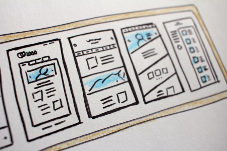
Design is your brand.
When it comes down to it, website design matters. Design is your brand. And agents and editors want to know that you’re treating your brand like a business, not like a hobby. This means that you’re willing to invest significant time and money into creating a website that clearly communicates your brand.
Think of your website like a room—the only room in your house you can show to the world. It’s sort of like a 19th-century parlour, where every item is displayed for the sole purpose of impressing visitors.
Pretend every visitor to your website is like a visitor to your parlour. What do they see when they get there? Is it a sparse room, with a standard-issue style, that looks just like the last place they were at? Or is it carefully curated, with each item contributing to the overall picture of who you are?
A website should reflect who you are, what you do, and what you care about. When done well, it can even reflect the style of your books. A writer of women’s fiction might have bright, cheery colors that mimic her book covers. A YA writer might have a hip, funky design, and a self-help writer might have a serene and inspirational look.
Your website is a blank canvas, and it can say a lot more about you and your work than a double-spaced Times New Roman, 12-point page. So make it work for you—fill that canvas with words, photos, quotes, links, and other elements that speak loudly about who you are.
Encourage lingering.
When I open up a query letter in my email, I’ll often read the first paragraph, then start scanning for a website link. I specialize in practical nonfiction, so if an author doesn’t have a website, there’s usually very little chance I can work with them (with a few notable exceptions). But these days, whether you write fiction or nonfiction, it’s essential to have an online presence. And the home base for that presence should be your website.
An effective website has clear messaging, is visually appealing, and invites the visitor to linger. A website should show agents and editors that you’ve created a place where they (and readers!) will want to spend time, get lost digging through the archives, and leave feeling inspired and connected to you.
When I open up a website that is clearly a standard-issue template, it says that the author doesn’t know how (or hasn’t yet) defined their brand. But when I open up a website and see interesting and informative articles, beautiful images, and a dynamic interface, full of ways to connect and corners to explore, I find myself lingering. I’ll start clicking here and there, reading posts, and getting lost in the author’s voice and perspective. It’s not unlike writing a compelling story—you want every visitor and every reader to get lost in the world of your website.
You have 10 seconds.
For a visitor to linger, you have to give them a reason to click away. And the truth is, you only have about ten seconds to win over an agent, editor, or casual reader when they click on your website. That’s how long it takes to assess whether this is a place to explore further, or whether it’s a one-dimensional place with little to offer.
So make sure that when your page loads, visitors are instantly greeted with something clean, professional, and visually appealing—something that looks like you. If possible, work with a professional graphic designer or branding expert if you need help defining your look. They should be able to synthesize your style, viewpoint, and goals into clear and consistent design elements.
If you want to try making improvements yourself, there are fantastic resources out there to get you up to speed—try a Skillshare class on web design or logo design (just $20), or search for upgraded or premium templates that work with your current site. Just remember to customize so that it looks like you, not like a standard-issue template.
As you start building, keep the 10-second window in mind. To create the strongest first impression, you’ll need these key elements to be above the fold (before needing to scroll):
- Your website name—for an author site, this should be your name or pen name
- An image, logo, or graphic element incorporated into the masthead
- Social media icons
- A professional looking photo of you
- A tagline: What are you about? What is your mission for the site? (Here’s a great post to help you define your mission statement.)
- A subscribe box where visitors can sign up to receive all your posts via email. (This is one of the best ways to stay sticky with a visitor who may be passing through for the first time.)
- Page tabs: Home, About, and Contact are the essentials. Other options can include: Books, Events, Speaking, Press, Classes, Projects, Post Series, Advertise, Archive, Media Kit, Work With Me, Etc.
Remember that what will set your website apart is the sense of identity it conveys to an editor, agent, or reader. Show them something that delights them, inspires them, and excites them, and they might take a chance on you.
For design inspiration
- Nonfiction: The Handmade Home, The Forest Feast, Brené Brown
- Fiction: Rainbow Rowell, Maureen Johnson, Emma Straub
Maria Ribas is a literary agent, home cook, moderate minimalist, obsessive organizer, and hopeless non-baker. She helps authors find the right publisher and right deal for their work, and specializes in nonfiction. Visit her website, cooks & books.


Could not agree more! In today’s world whatever your business – author or otherwise, your website is likely to be the first impression someone has of you.
I like your ten second window. But it might be a second more than what we have anymore in terms of attention. The current research says the average attention span for humans is less than the nine second average for goldfish!
Interesting! We should all run to the pet store and make sure our websites are goldfish-approved then. 🙂
Very early in creating a site and this is a great guidepost. Thank you!
Thanks, Maria. Your good advice will help me reinforce what I suggest to my clients. It’s sometimes a struggle to convey the concept of first impressions, and you’ve nailed it.
I always recommend that authors put their email addresses on their websites and blogs, so book bloggers, reviewers, reporters, and even agents can contact them easily. Most aspiring authors fail to include contact information on their sites.
That is so true! I was just speaking to an editor at a publishing house who was saying how she often scouts talent but then can’t find an email address or contact form for the person. It seems obvious, but if you want new opportunities, you have to give people a way to reach you.
Exactly! When I start feeling like a stalker (i.e., after five minutes of searching online), I give up on trying to contact someone. I assume the person doesn’t want to be found.
[…] Photo by Andrea Costa / via Flickr Today’s guest post is by literary agent Maria Ribas (@maria_ribas); check out her website, cooks & books. […]
You nailed it, Maria. I started a blog this past spring, and have learned a million different things about web design. For me, it’s both exciting (the design and copywriting) and frustrating (the techy part of it). Thanks1
Glad it was helpful! The techy part can be awful, but it’s all worth it when you have that perfect online home for your work.
You’re so right, Maria. Thanks for responding and for the great info!
This is very helpful. I’m just graduating from an MFA program and really want to revamp my blog but have been overwhelmed with the process of it. This post gave me lots of great examples to get started. Thank you!
It can be VERY overwhelming, but it helps to focus on one tiny improvement at a time, or to go with an easily customizable template. After all, we’re writers, not coders!
[…] Today I’m over on Jane Friedman’s wonderful blog talking about why design is such a big, big deal for blogs and websites. If you’re just starting to build your platform, or want to take your work to the next level, you’ve GOT to make it look appealing. Design is your brand, and you only have about 10 seconds to win over someone who wanders through your online home. (According to #science, no one has an attention span anymore…) Read more about the 7 things you need need on your site to make a strong first impression here. […]
[…] Why Design Matters for Your Author Website by Maria Ribas […]
[…] Read more of Ribas’ advice on Jane Friedman’s blog here: “Why Design Matters for Your Author Website” […]
[…] presence, you should have an author website—and it needs to be a good one. Maria Ribas explains why website design matters, and Tucker Max tells us how to build a book landing […]